
Jake O'Brien
Graphic Design | UI/UX | Web Dev
Mocking up Evasyst's application UI
Jan 22, 2018
Evasyst is a startup in LA that I worked with last year, mostly designing their application UI. It's basically screensharing for video games for increased gameplay coordination. Being avid gamers, we had a lot of ideas of where to go with this.
My first thought on the UI was to play it safe and emulate the ever-popular 3-column layout made popular by Slack, Twitch and Discord, and then wow the user with our unique feature set.
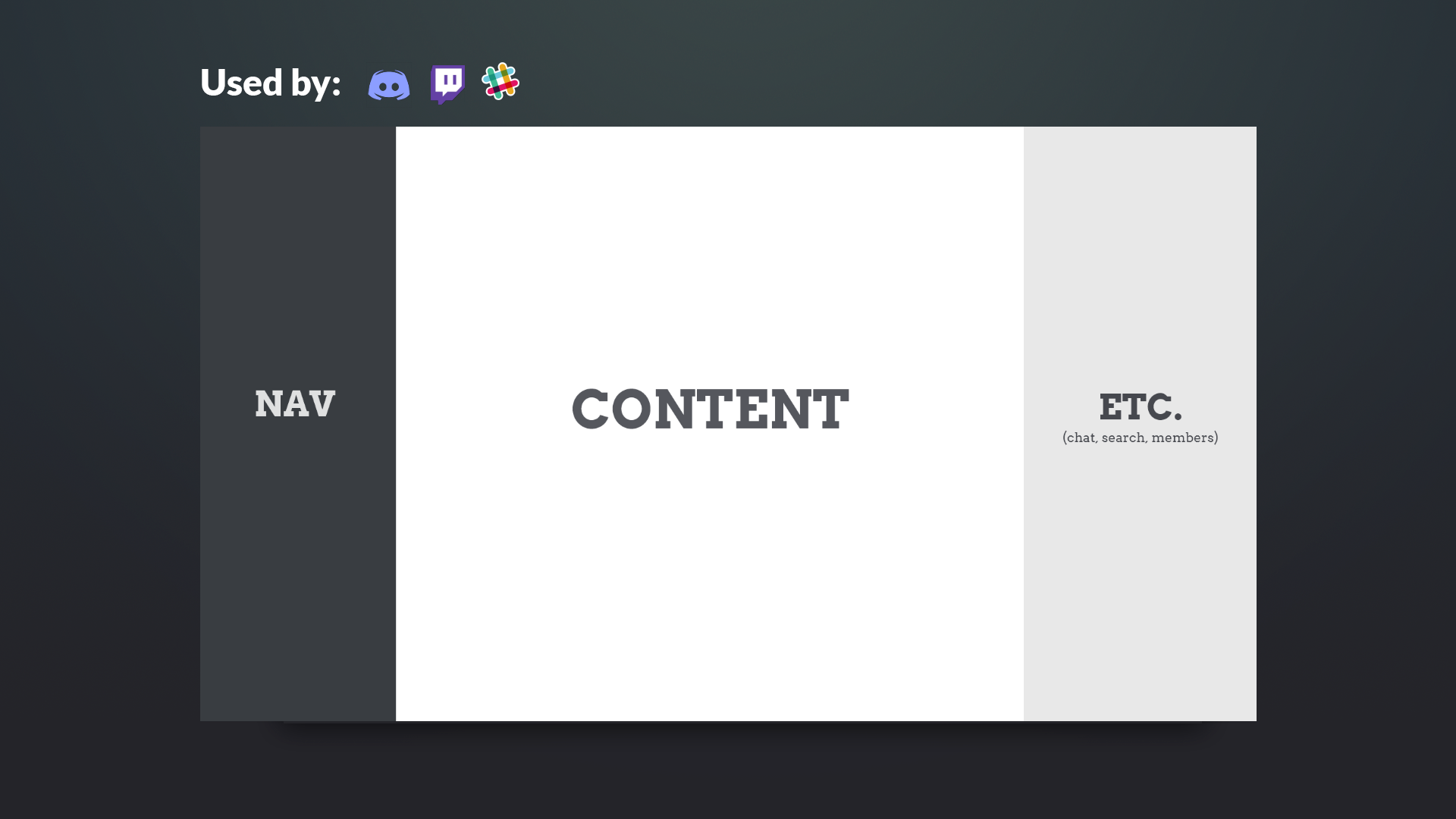
- First column - top level app navigation
- Middle column - the main content of the app
- Third column - extra features like search, member list or chat
We had 2 initial wireframes like these, and were deciding on whether or not to challenge the status quo of the 'left-to-right 3-column' layout that is so popular in recent notable platforms. I argued that we had enough differentiation with our primary screensharing feature to stick out in our users' minds, and should just play it safe by going with the 3-column layout.
And here's what we finally settled on after MUCH debate.
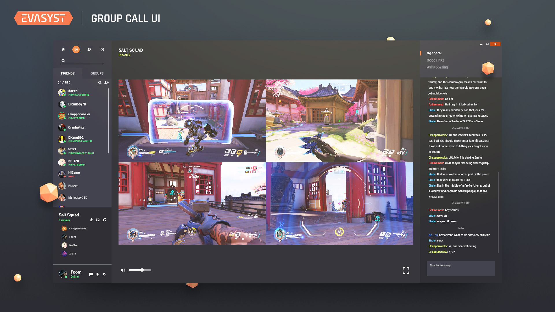 Group Call UI in dark-mode
You'll notice quite a few changes:
- We took out our logo in the top left, as this is a desktop app and not a web app, and instead condensed our navigation bar into a hexagon-themed set of buttons.
- Dark-mode is enabled by default when you enter a group call, as the gameplay will likely be quite bright and would thus clash with a white background.
- We reverted back to the classic 3-column layout, as we realized that having one column handle both your friends list AND chat was going to be too cumbersome.